PM interview prep you can do on the metro
An offline-first coach that works underground, with no signal and no account
Almost all of it is PDFs. You read one, feel productive, and retain very little, because reading isn’t practising. It also assumes you’re sitting at a desk with a connection, which is not when anyone actually revises. People revise on the way somewhere.
One constraint, everything else follows
It has to work on a phone, underground, with no signal, without an account.
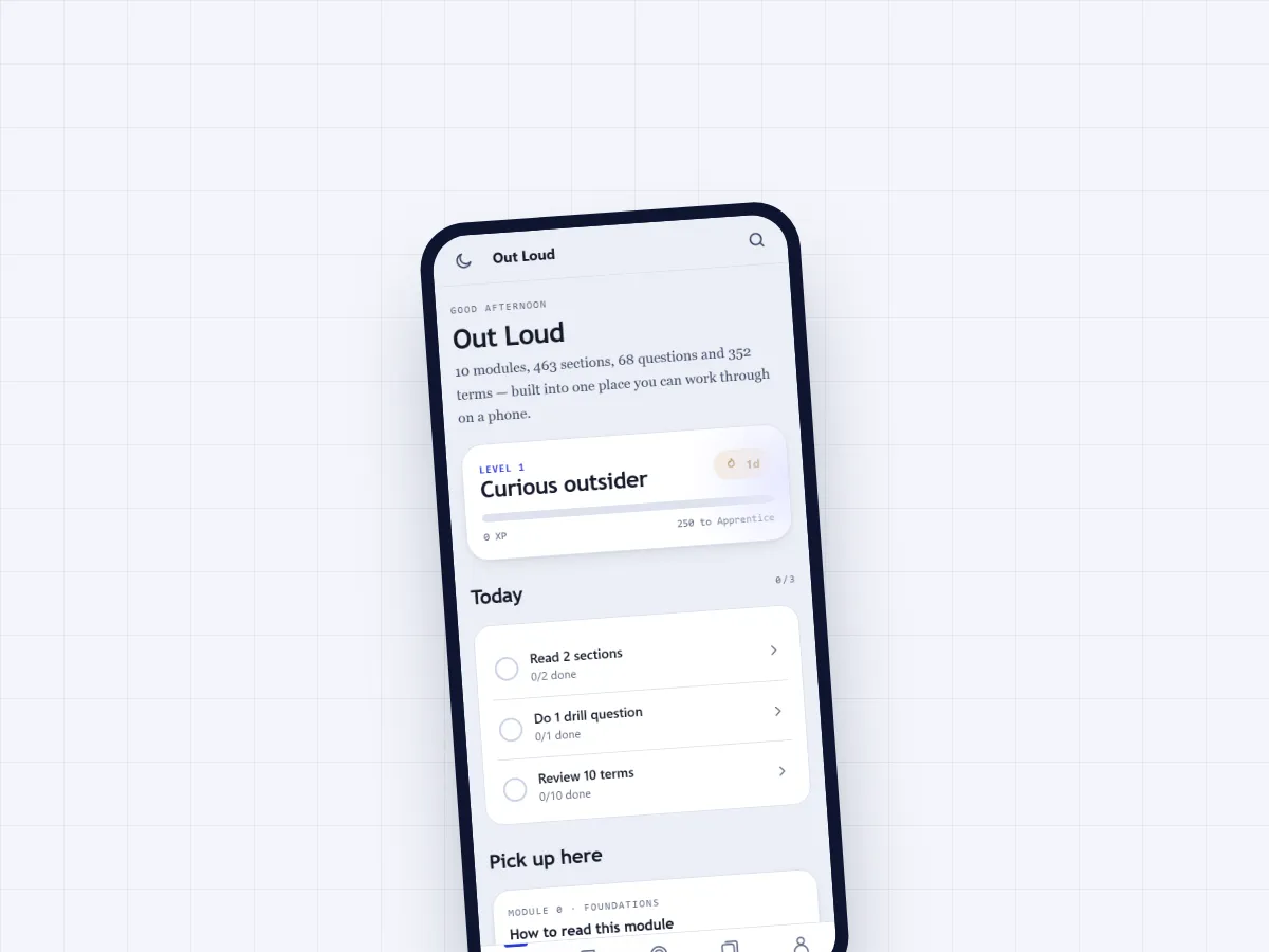
That single line decided the rest. No backend. Nothing fetched at runtime. index.html is 1.9 MB and holds the stylesheet, the app, and a 286,648-word content payload inlined as JSON. Vanilla JS in one closure, no bundler, no framework, no install step. A service worker precaches all nineteen assets, network-first on the HTML so a redeploy still lands, cache-first on everything else. I tested it by killing the server and checking the offline render came back byte-identical.
Fonts are self-hosted too, twelve woff2 files at 499.5 KB against a 600 KB budget, so a cold offline load renders properly instead of dropping to system fonts halfway through a session.
What’s in it
Ten modules across 27 chapters. 68 practice questions with model answers. A 352-term glossary running on Leitner boxes at 1, 3, 7 and 21 day intervals. Progress tracking that shows what you’ve actually drilled rather than what you’ve scrolled past.
Every attempt gets scored against the same five things interviewers grade on: structure, user empathy, prioritisation, data reasoning, communication. A fixed rubric, so week four is comparable to week one.
Accessibility, measured not assumed
All ten colour token pairs across both themes came in at 4.5:1 or better. Four light-mode pairs failed initially and got fixed by darkening the tokens while holding the hue. The worst offender was a primary button label sitting at 2.65:1 in dark mode, caused by a hardcoded white against a themed background. It’s a themed token now at 7.07:1. Every interactive element is at least 44 by 44 px, checked across all five tabs at 375 by 812.
The trade-off I’d revisit
A 1.9 MB single file is the right answer for offline and the wrong answer for first load. Someone opening it for the first time on mobile data waits longer than they should. I’d split the content payload from the shell so the app becomes usable immediately, then pull the glossary down in the background.